
By Nick De Carlo on December 14, 2016
Drum Corps International (DCI) labels itself “Marching Music’s Major League”, and it is the amalgamation of years of musical study, marching precision, and entertainment. Participants range in age from 14-21 and come from all over the country to march in numerous competitions throughout the US from June until August. The ensembles are made up of brass instruments, percussion, and a color guard and/or rifle line. Anyone familiar with marching bands will be (almost literally) blown away with the intensity and skill of these ensembles.
My interest in DCI led me to seek answers to three questions by means of data visualization with Tableau:
- Can we see score inflation over time?
- Is the location of Finals moving more toward the center of US population?
- Is there a shift in winning corps from one side of the country to another?
I used Tableau Public (https://public.tableau.com/s/) to create these visualizations, a free, cloud based, data visualization tool. Tableau Public is helpful in putting together visualizations that you would like to share, without having to forward massive files. To get the best results, you will first need to have your data organized in spreadsheet form. Should you not have access to Microsoft Office, other programs such as Google Docs, or Open Office (https://www.openoffice.org/) are available as free alternatives.
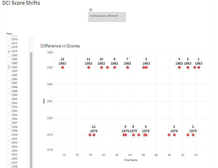 Every summer we see amazing talent on the football fields across the US, yet despite this, there seems to be a trend that is somewhat concerning – an inflation of scores. My visualization (http://tabsoft.co/2hGfvve) allows users to choose any year or group of years to compare the different placements and their respective score. By selecting 2016 and every finals competition 10 years previous, a trend emerges. First place has generally remained near the upper 90’s, but we can see a stark upward movement for the lower six places between 1972-2016. The difference between first and last has become less pronounced as the years go on, displaying an inflation in scores for the lower finalists. Now, one could argue that the corps are just improving in quality – which may be the case – but the data suggest that the top six have maintained a similar scoring spread for over 40 years. Why would judges inflate the scores of the lower six corps? The dataset I used for this comes from Drum Corps International’s database of Finals scores (http://bit.ly/2gTrWoN).
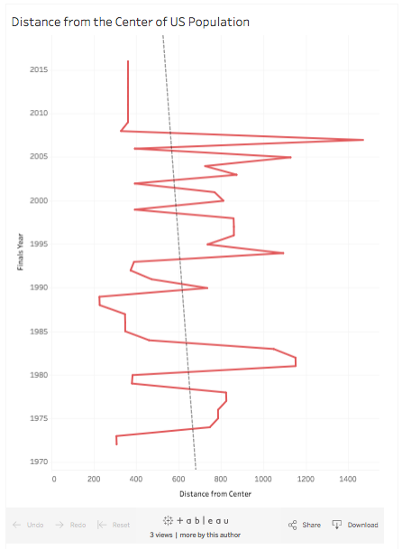
In addition to the scores provided in this data source, I also wanted to geocode the location of Finals as well as the center of population in the US during that decade. I geolocated both the centers of US population by decade, and each location for DCI finals. This was facilitated with an add-on for Google spreadsheets (http://bit.ly/2iRUdxn). In order to calculate the distances between the geolocated cells, I used the formula found on BlueMM (http://bit.ly/2hX2dJM). Once the data were all properly organized, cleaned, and ready to be imported into Tableau, I checked to see if DCI was moving Finals closer to the center of US population (http://tabsoft.co/2hDDgEw). The resulting graph’s trend line shows how there appears to be a general shift toward the center with the exception of 2007, when finals were held in Pasadena, CA (the only finals event to be held on the west coast). Beginning in 2009, finals have been held in Indianapolis, IN, hence skewing the data more toward the current center of population, Texas County, MO (395 miles from Indianapolis).
 The last visualization (http://tabsoft.co/2hsCdcl) pertains to a general shift in top scoring corps to the west coast. Drum corps did not appear out of nowhere in 1972, but was an outgrowth from the drum and bugle corps of earlier times, often sponsored by the Veterans of Foreign Wars organization or the American Legion. These groups were formed after WWI and WWII, and since most of the populace of the US lived more toward the eastern seaboard, more corps were found in that area. Over time, as the US population moved west and DCI expanded, we begin to see a shift in higher scoring corps more toward the western region. For this final visualization, I used the 4 regions of the US census bureau and have created two charts. One is a bar graph, showing the average scores of corps across the US based on their census region. The user may choose the year with the slider provided above. The second visualization on this dashboard reflects the average placement of corps throughout the US. The user may choose a particular average score and see where these scores can be found. In addition to the score, the user can also pick individual years or groups of years to see if there is a shift in average scores for different regions on the map. This group of visualizations reflects a trend that one would possibly expect: As time goes on, the Pacific and Mountain regions gain in strength, as the US population (and, by some extension, its wealth) continues to shift westward.
In conclusion, using Tableau Public is a nice way of sharing whatever data visualizations you may have. There are many creative data visualists out there, and some of their work can be found at https://public.tableau.com/en-us/s/gallery. If you’d like a handy breakdown and tutorial of Tableau Public, UCLA’s DH 101 page (http://dh101.humanities.ucla.edu/?page_id=163) is a great resource.
Should your interest in Drum Corps be awoken, please check out both DCI’s website (http://www.dci.org/) and Corps Reps (http://www.corpsreps.com/) for more information on this amazing activity.
Feature image: 0053yam.jpg by Yamaha Bell & Barrell. Image copyright is held by the original owner.
Nick de Carlo currently works at HumTech as a Research and Instructional Technology Consultant (RITC) and is a C.Phil in Germanic Linguistics. His research interests include corpus linguistics, semantic shift, historical Germanic languages, and urban archaeology. Beyond these fields, Nick is an overly enthusiastic tuba player who plays Balkan, Mexican and American music.
Resources:
- Corps Reps (http://www.corpsreps.com/)
- Drum Corps International (http://www.dci.org/)
- Drum Corps International’s database of Finals scores (http://bit.ly/2gTrWoN)
- Open Office (https://www.openoffice.org/)
- Tableau Public (https://public.tableau.com/s/)
- UCLA’s DH 101 page (http://dh101.humanities.ucla.edu/?page_id=163)
- Visualization 1 (http://tabsoft.co/2hGfvve)
- Visualization 2 (http://tabsoft.co/2hsCdcl)