By Thomas Garbelotti on October 2, 2018
You may have noticed that CCLE got an upgrade over the summer. As we mentioned in June the Moodle 3.4 (on which CCLE is built) comes with some new features, security enhancements, and a more streamlined appearance. Among the many changes to the system is a newly redesigned home page.

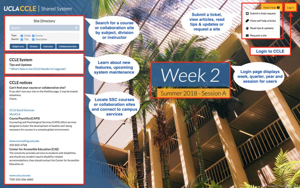
The first thing you may notice is that the current week number is displayed in large font in the center of the screen. The current quarter is listed just below that, while CCLE updates and notices are moved off to the left-hand side of the screen.
The biggest functional change to the home page is the new site directory search bar. The expanded search bar in the upper left-hand corner allows users to search by subject, division, and instructor. You can also search course descriptions and expand searches beyond course sites to CCLE collaboration sites. This enhancement promises better functionality over the old site search.
The rest of the home page will look the same. You can still log in through the link at the upper right-hand corner of the screen. Next to that is a link to help topics, from which users can submit a help request to the OID team, view help documents, get tips and updates, and request a new CCLE site. And, of course, the home page will feature photographs of our beautiful UCLA campus.
Screen shots provided by the author.
