Generative AI for Data Visualizations
If you're a UCLA student aiming to enhance your data storytelling skills, leveraging ChatGPT for data visualization can be a game-changer. Whether you're working on a research project, a class presentation, or are exploring data for personal interest, ChatGPT can assist in transforming raw data into compelling charts and maps. This guide will walk you through the process, ensuring you can create effective visualizations even without extensive coding experience
Understanding ChatGPT's Capabilities
ChatGPT, especially with the Advanced Data Analysis feature, can generate various types of charts, including bar graphs, line charts, pie charts, and scatter plots. It utilizes libraries like Matplotlib and Pandas to process and visualize data. By providing natural language prompts, you can instruct ChatGPT to create visual representations of your data, making complex information more digestible.
Preparing Your Data
Before diving into visualization, ensure your data is clean and well-structured. ChatGPT can assist in data cleaning tasks such as handling missing values, normalizing data, and identifying outliers. Uploading your dataset in formats like CSV or Excel allows ChatGPT to analyze and prepare the data for visualization effectively.
Crafting Effective Prompts
The key to successful data visualization with ChatGPT lies in crafting clear and specific prompts. For instance, you might say, "Create a bar chart showing the average test scores of students across different departments." Being explicit about the desired outcome helps ChatGPT generate accurate and relevant visualizations.
Generating Charts
Once your data is ready and you've formulated your prompt, ChatGPT can generate the necessary code to create the visualization. It will provide you with Python code using libraries like Matplotlib, which you can run in your local environment or platforms like Google Colab to produce the chart. This process allows for customization and refinement based on your specific needs.
Creating Maps
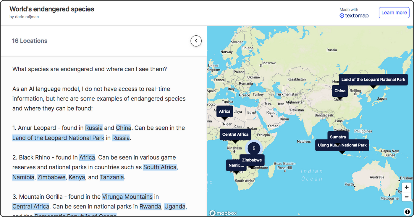
Beyond standard charts, ChatGPT can assist in generating maps to represent geographical data. By integrating with tools like Textomap, you can create interactive maps that display data points across different regions. For example, mapping the distribution of endangered species globally can be achieved by prompting ChatGPT accordingly.
Customizing Visualizations
After generating the initial visualization, you might want to customize it to better fit your presentation or report. ChatGPT can guide you through modifying elements like color schemes, labels, and chart types. By iteratively refining your prompts, you can achieve a visualization that aligns with your desired aesthetic and informational goals.
Integrating Visualizations into Your Work
Once satisfied with your visualizations, you can incorporate them into your academic work. Whether it's embedding charts into a PowerPoint presentation or including maps in a research paper, these visual aids can enhance the clarity and impact of your findings. Ensure that the visualizations are appropriately labeled and cited to maintain academic integrity.
Further Learning
To deepen your understanding of data visualization, consider exploring additional resources and tutorials. Platforms like Beebom provide guides on drawing graphs and charts using ChatGPT, offering step-by-step instructions and examples. Engaging with these materials can enhance your proficiency and open up new possibilities for data representation.
By integrating ChatGPT into your data visualization workflow, you can streamline the process of transforming complex data into clear and impactful visual narratives. This approach not only saves time but also empowers you to present your findings in a more engaging and accessible manner.